Dow Chemical set out to modernize its corporate website with a scalable, design system that could support a large, content-heavy ecosystem. The challenge was creating a responsive experience that maintained clarity and strong brand consistency across multiple business units and use cases.
As Lead Designer, I helped reimagine the company’s digital experience through a modern, mobile-first platform centered around innovation, usability, and customer needs. The redesign included Dow’s corporate site along with two major business units — Dow Packaging and Dow Water & Process Solutions — creating a more unified and scalable digital ecosystem.
Client: Dow Chemical Role: Design Lead & Content Strategist
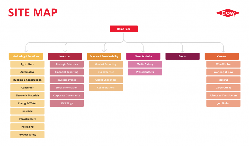
One of the first things I tackled after joining the project was a comprehensive sitemap audit to understand the existing content ecosystem and how information was structured across the site. It quickly became clear that the experience needed a major overhaul — shifting the information architecture away from internal business silos and toward a more user-centric model organized around markets, products, and customer needs.
Key Improvements:
Simplified and streamlined information architecture
Navigation reorganized around industries, applications, and user goals
More unified and discoverable product ecosystem
Stronger emphasis on innovation and sustainability
Homepage redesigned around storytelling and guided pathways
Improved scanability based on user intent and task flow
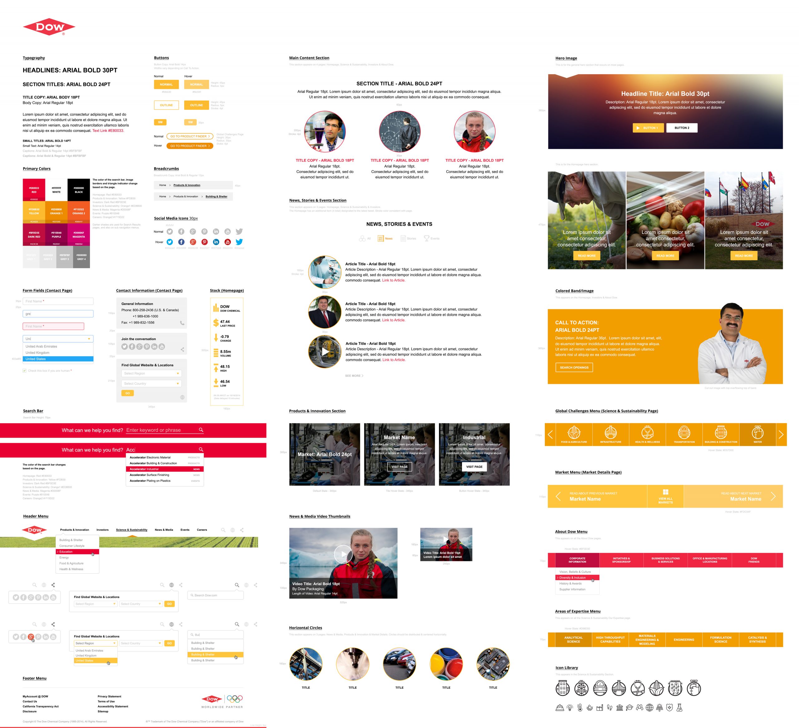
Visual Identity
With no time for user interviews, we jumped right into the design phase. I created some quick mood boards and peer analysis to align with the client’s vision for the new site. I knew immediately that we needed big and bolder typography, and I greatly expanded the color palette to make the site more varied and vibrant. Additionally, I incorporated custom iconography throughout the site, and especially for Dow’s Global Challenges that they were tackling through innovation and sustainability. Lastly, I designed modular components that could be easily reused throughout the site.
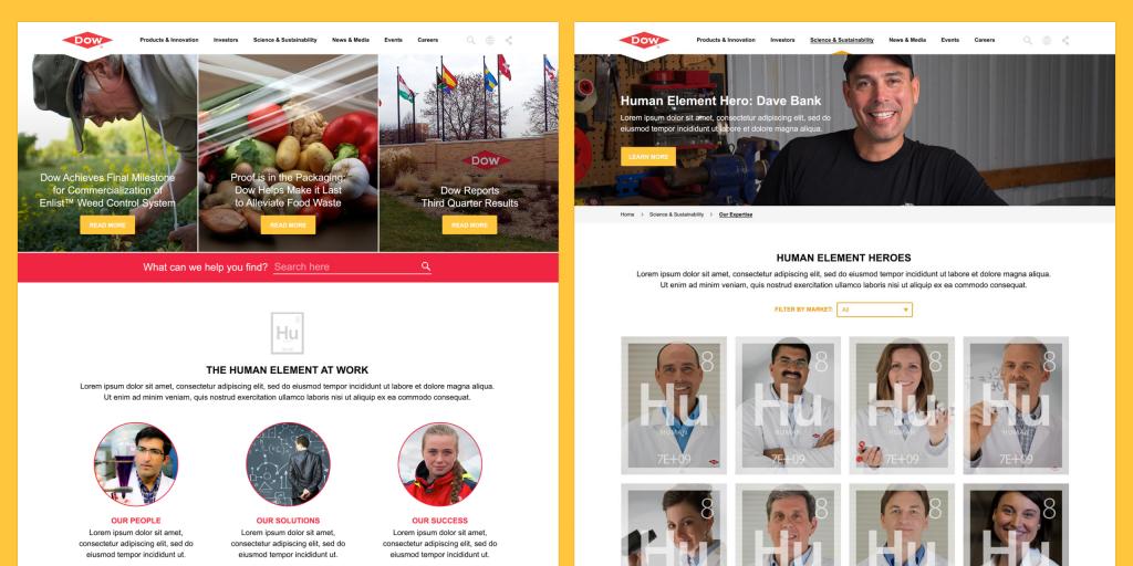
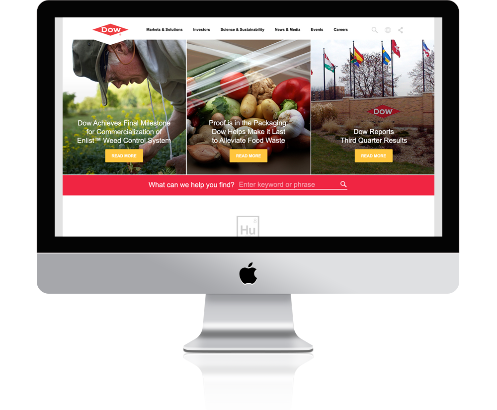
We began with the homepage by rethinking content hierarchy and prioritization. Because Dow consistently had new stories, innovations, and initiatives to highlight, the experience needed stronger featured content, clearer calls to action, and more intentional storytelling. A dedicated, dynamic hero area allowed users to immediately engage with the latest news and featured initiatives, while a curated news feed further down the page provided filtered access to News, Stories, and Events.
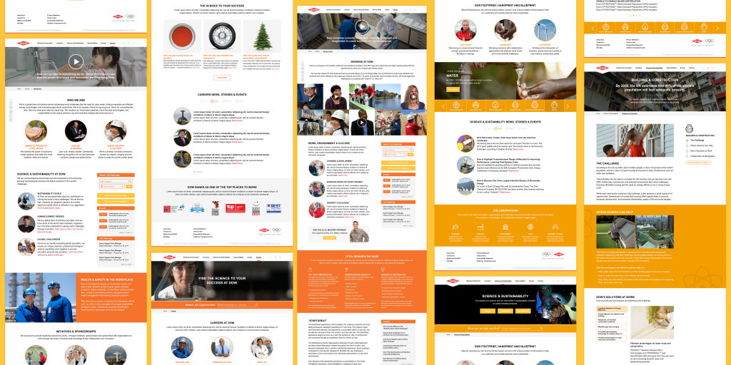
Once the homepage experience was established, the visual system and interaction patterns were extended across the rest of the site using the updated sitemap as a framework. Leveraging the scalable design library I built, I designed more than 50 unique screens based on over 100 wireframes, helping create a more cohesive and consistent experience across the platform.
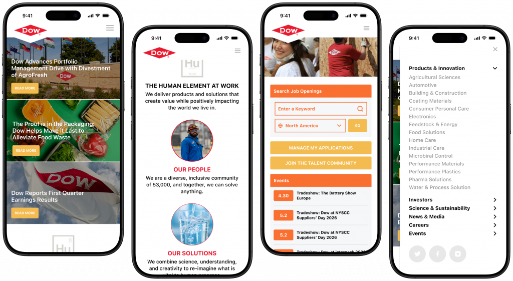
Mobile-First Design
The redesign was approached with a mobile-first, responsive mindset to ensure the experience remained intuitive and accessible across devices of all sizes. At a time when many enterprise websites were still heavily desktop-oriented, the new design prioritized flexible layouts, scalable content modules, touch-friendly interactions, and simplified navigation patterns. This approach improved usability while also forcing greater clarity in content hierarchy and prioritization, ensuring the most important information remained front and center regardless of screen size.
Logo Treatment
The Dow logo has such a bold and distinctive geometric shape that I wanted to integrate it directly into the experience rather than treat it as a standalone brand asset. The carved negative space at the bottom of the logo became a functional design element — acting as a subtle directional cue that guides the viewer’s eye toward the primary content on the page. By leveraging both the visual weight of the logo and the intentional use of negative space, the design reinforces hierarchy while creating a natural focal point across the experience.
Global Search
Search became one of the most prominent elements in the experience because of the scale and complexity of Dow’s product ecosystem. With thousands of products, technical documents, industries, and resources spread across the site, many users arrived with a specific task already in mind. Elevating search reduced friction and created a faster, more direct path to products, data sheets, technologies, and market-specific content — reinforcing the site’s shift toward a more user-centric, task-oriented experience.
Brand Opportunities
Even utility moments like the 404 page were used to reinforce brand personality. Instead of a generic error state, the design uses immersive imagery, approachable messaging, and a clear search path to keep users engaged. Large-scale visuals maintain the site’s innovation-driven tone, while the interface ensures users can quickly recover and continue their journey.
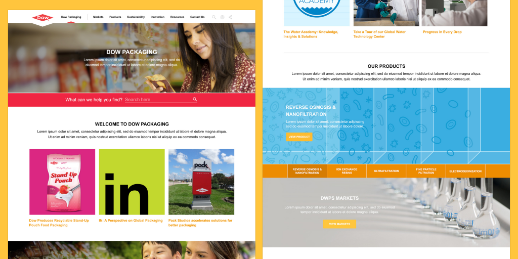
Scalable Solutions
Because the design was modular, we were easily able to extend this system to other key business units, Dow Packaging and Dow Water & Process Solutions, balancing consistency with the flexibility each needed. The result was a cohesive, scalable experience that strengthened Dow’s digital presence while significantly improving usability on mobile.
Outcomes & Transformations
The redesign felt like a clear shift from a traditional corporate homepage toward a more modern, editorial, and mobile-conscious digital experience.
2. More responsive/mobile-first layout thinking Responsive-first design where rows stack more naturally.
3. Cleaner navigation architecture Improved discoverability and reduced cognitive load.
4. From “company-centric” to “customer-centric” Aligned with broader innovation strategy and messaging.
5. More modernvisual design language Adopted visual trends that became dominant in enterprise UX.
6. Better content prioritization More intentional about hierarchy and what gets attention.
This helped evolve Dow.com from a dense, corporate information portal into a more modern, customer-centric digital platform. By simplifying the information architecture, prioritizing discoverability, and introducing a more editorial and responsive experience, the new site better reflected Dow’s broader focus on innovation, sustainability, and global problem solving.
Greg provided the initial layout explorations and end-state designs for the next-generation of dow.com. However, his contributions extend far wider and deeper. Not only did he go above and beyond his duties as designer, but he also provided crucial support within Dow’s new content management system. Without Greg and his impressive creative talents, as well as his assiduous efforts to pitch in and help out wherever needed during the project, dow.com would not be the solid cornerstone of Dow’s play in the digital space.
Dan Sanborn Dow Global Corporate Digital & Social Media Leader
Greg single handedly developed the design of new Dow.com Corporate property, and customized that design for two Dow business units. Greg was responsible for developing mock ups for all major site sections, aggregate feedback from Dow stakeholders, and deliver optimal digital experience through design. Greg’s designs were not only extremely well received by the client, but his ability to explain the thinking behind page’s design and accompanying content showed the client just how much of an expert Greg was in the place.
KC Maddock Manager, Digital Marketing, Accenture
Greg was the lead single point of contact for the creative design of the new Dow Chemical website. From his early time on the project, Greg was able to develop creatively and visually stunning website mock ups to help gain stakeholder alignment and quickly develop Avanade/Accenture credibility. As the design advanced, Greg successfully led the creative composition development across 7 distinct client stakeholder groups while creating 50 visual comps based on over 100+ wire frames.
In my opinion, Greg is a creative genius. He not only has the skills to develop compelling designs but also has the patience and client presence to walk a group of senior leaders (client and ACN/Avanade) through the designs. Throughout the design process, Greg had a compelling vision for what the site should be – he was able to facilitate the design with leadership to ultimately deliver a very successful product.
John Campbell Senior Manager, Technology Strategy, Accenture
Greg was *the* UI authority for the new dow.com site redesign. He was in a very customerfacing role and had total authority and autonomy to influence the design. He became a trusted advisor to both Accenture and the customer and was used in many capacities far beyond what we brought him on to do. Strengths Greg’s productivity is amazing he’s ability to turn around high quality designs in a short amount of time was definitely something we came to rely upon (if not take for granted). He was able to extendbeyond the web site and into campaign emails and even internal tools.
Matt Dinovo Director, Avanade
Put simply, our 11 month project –including the launch of Dow’s corporate site and two business unit sites – would not have been the success it was without Greg. He was given very little direction in terms of information architecture/site map, wireframe, or artistic direction – but time and time again, he was able to develop designs that impressed our client leaders. Part of Greg’s success was due to the quality of his designs, but I also believe a major factor in his success was the way in which he conducted reviews with senior client leaders. Greg was one of our strongest team members and I would do whatever I could to staff him on my next similar engagement.
Michael Menzer Senior Manager, Technology Strategy, Accenture